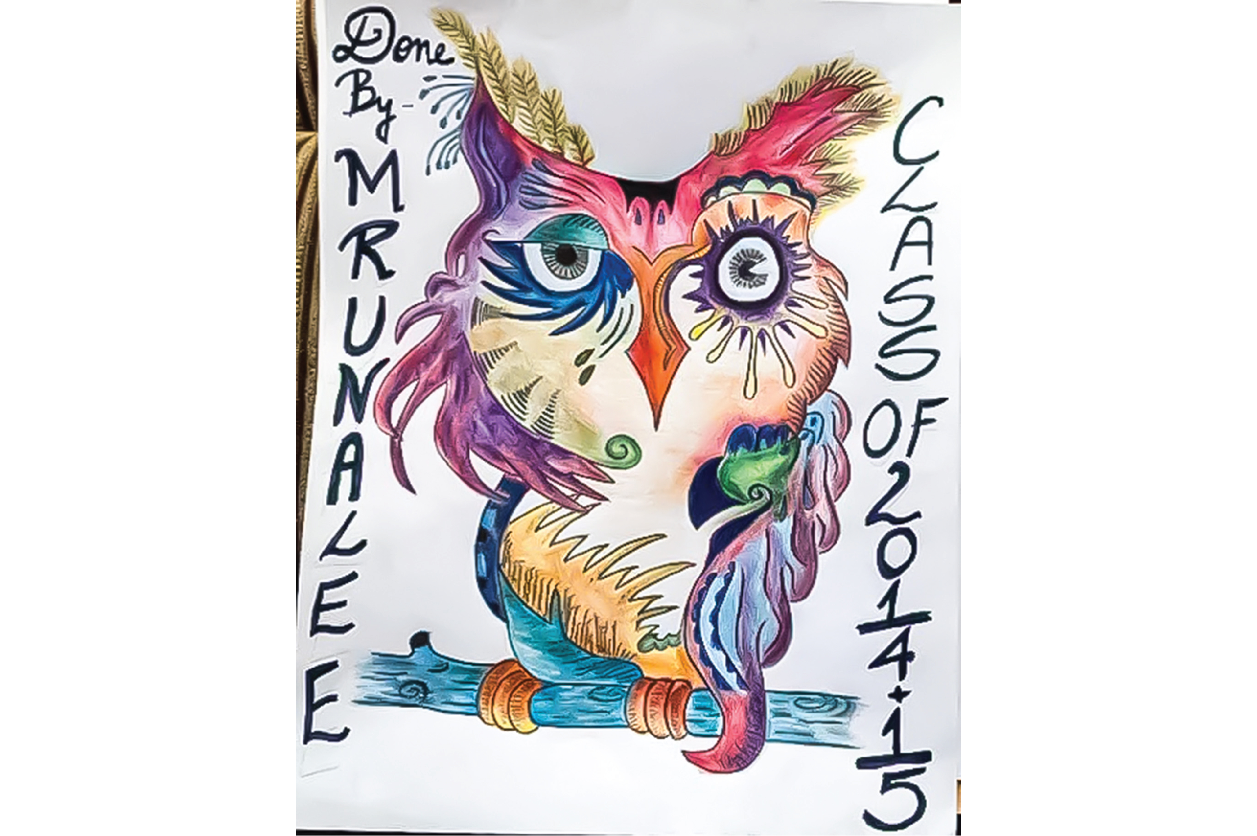
As a child, I always loved art and often wondered how artists become truly successful. My parents were my biggest supporters and encouraged me to develop my creativity every step of the way. Whether it meant providing the tools to imagine a purple octopus on the moon or supporting arts-infused learning in the classroom, their encouragement shaped my passion for creativity.
Artist Mode was created to help parents and educators nurture creatively confident children who grow into inspired and original adults. Our studio is a unique space that brings everything together under one roof — offering a wide range of natural, eco-friendly art products along with in-store workshops for all skill levels.
- Mrunalee / Artist, Designer
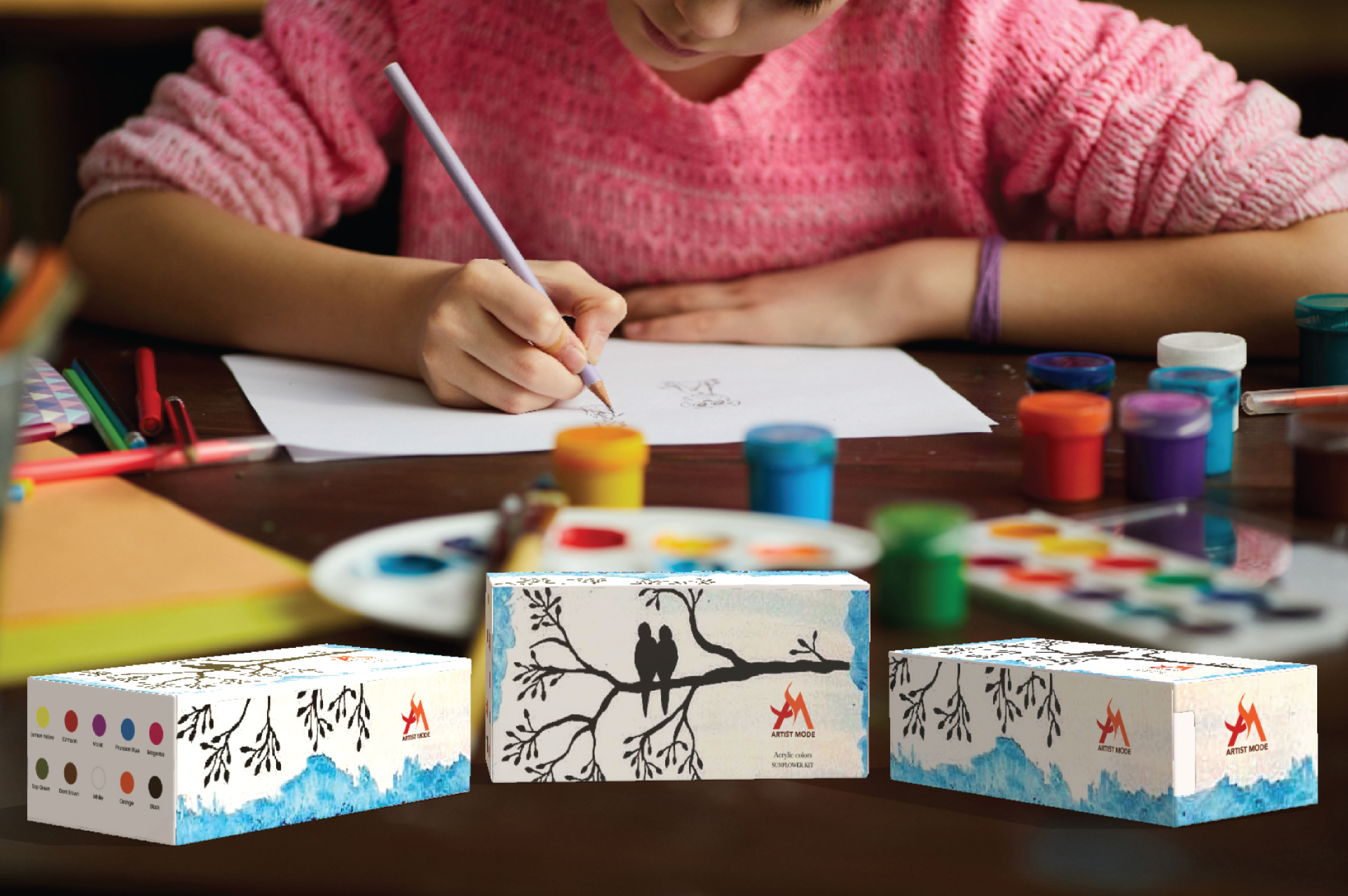
I drew inspiration for the paint-stroke elements from visual references that reflect an artistic, handcrafted feel. These strokes help communicate Shakahari as a creative and expressive brand.
For the typography, I was inspired by the Arts Midwest logo. Because the logo symbol already carries an artistic personality, I chose a clean and simple wordmark to maintain balance and clarity rather than using decorative script fonts.
When we think of art, paintbrushes and palettes naturally come to mind. I created several sketches inspired by the idea of paintbrushes combined with script, sans-serif, and serif typefaces. For the final design, I selected the bottom-center concept featuring the letters A and M locked together in a clean sans-serif style.

To maintain the logo’s visibility and impact, always surround it with sufficient clear space. No text, images, or graphic elements should enter this protected area.
Clear Space (Live Area):
The clear space is calculated using the height of the logo (x):
Minimum size:


Red and orange are the heart of our visual identity—playful, energetic, and engaging. These core brand colors are prominently featured in our logo and are most often used across our packaging and marketing materials. The logo should appear in the brand colors, black, or white. A white version of the logo may be used on solid-colored backgrounds. In certain applications, the logo icon or the logotype may be used independently; however, in all other cases, the full logo should be displayed to maintain brand consistency.
Avenir is highly legible and dignified, making it an excellent choice for body text. Its sharp, high-contrast forms also work beautifully in elegant advertising. I often default to Avenir for writing and establishing body typography until a better option presents itself. For this project, however, I paired it with Baskerville for headlines. Baskerville has just enough character to make a stylistic statement while remaining neutral, readable, and effortlessly refined.
I have had a passion for art since a very young age, so I chose to incorporate my own sketches and paintings to create unique packaging. For Package 1, I used Prismacolor colored pencils, known for their exceptional quality and vibrant finish. For Package 2, I used Arteza watercolor paints to achieve a soft, handcrafted look. I then used Adobe Dimension to design and present the packaging in a realistic environment.
Every month, we host in-store workshops led by our collaborating artists. These three-day sessions are offered at Beginner, Intermediate, and Advanced levels. Click or tap Register Now, or visit artistmode.com to sign up for yourself or someone you know—and enjoy 10% off our products.
Users can use our app to create wall art in Augmented Reality without worrying about damaging their walls. We offer a variety of ready-to-use templates, along with multiple brush and pen styles that help give every design a professional finish. Once the artwork is complete, users can view the final result along with the supplies used and easily purchase the materials they need.