
Bon Beauty
Naturally You
About the
Project
In my younger years, I was drawn to a simple and balanced approach—one that blended natural care with high-quality, luxurious cosmetics. Dealing with cosmetic concerns from childhood was often frustrating, and it inspired a bigger goal: to create a range of products that reflect trusted, natural, and healthy values while offering the versatility modern women expect—without compromising performance or style. With BON Beauty, you can feel confident about the quality and purity of your herbal cosmetic products. BON Beauty provides a wide range of natural beauty and cosmetic solutions for customers in India and around the world.
-
IndustryOrganic Beauty
-
MissionTo develop and deliver safe, effective skincare and wellness products that enhance overall skin health and well-being. Our vision is to become a trusted, innovative global leader offering authentic organic wellness solutions for mindful, healthy living.
-
TargetMale or female, age 20+, living in an urban or semi-urban area, outgoing in personality, from an upper or upper-middle-class background, and leading a health-conscious, innovative, and value-driven lifestyle.
Research
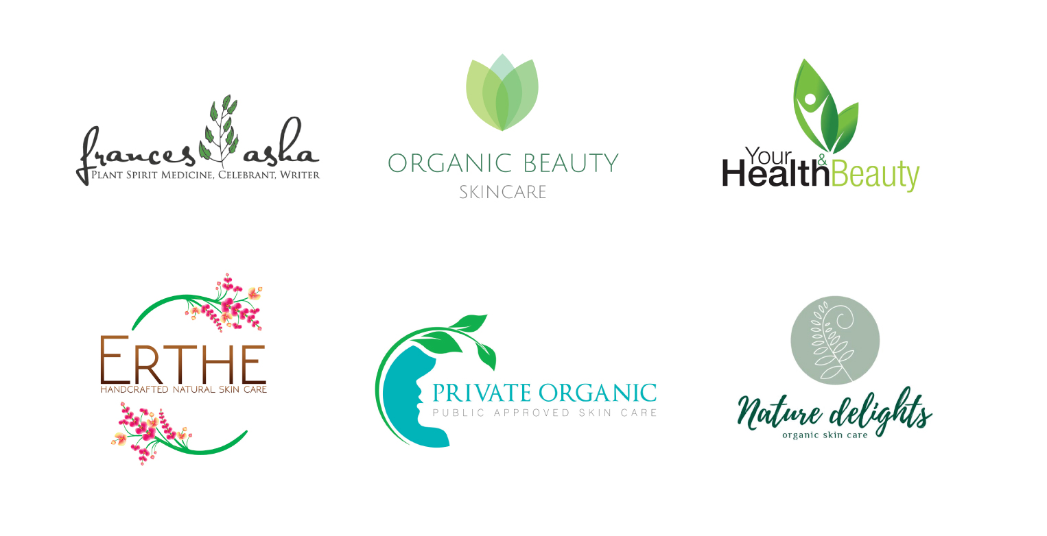
My inspiration came from noticing how leaves are commonly used in many logos. Since I created an organic and herbal skincare brand, I wanted to incorporate both leaves and water into the design. The color palette was inspired by the blue tone of the bottom-right leaf and the green shades from the other leaves.
Logo Usage
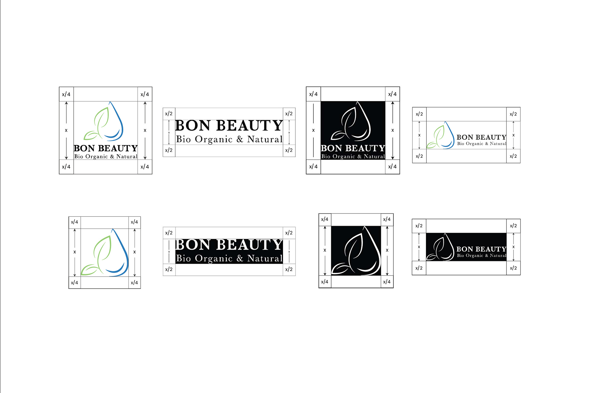
Whenever the logo is used, it must be surrounded by a clear live area to maintain its visibility and impact. No graphic elements should enter this space. Clear Space (Live Area): To calculate the live area based on logo type:
- Vertical logo: Live area = x/4 (where x is the logo height)
- Horizontal logo: Live area = x/2 (where x is the logo height)
- Symbol: Live area = x/4 (where x is the logo height)
- Wordmark: Live area = x/2 (where x is the logo height)
Color
Palette
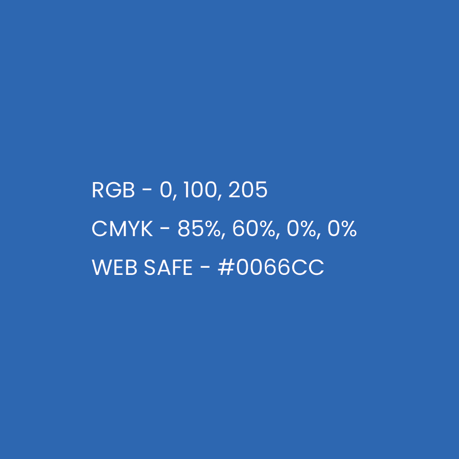
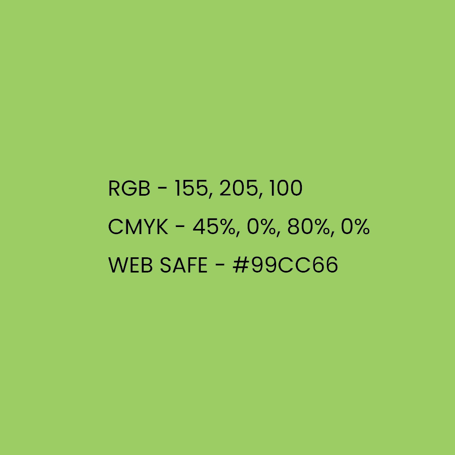
Inspired by nature, the brand palette captures the core hues most frequently used across the logo, packaging, and collateral — forming the foundation of the brand's visual identity. The logo should appear only in these brand colors, black, or white, with a white version reserved for solid-color backgrounds. In select communications, the icon or text may appear on its own; otherwise, the complete logo should always be used.
Typography
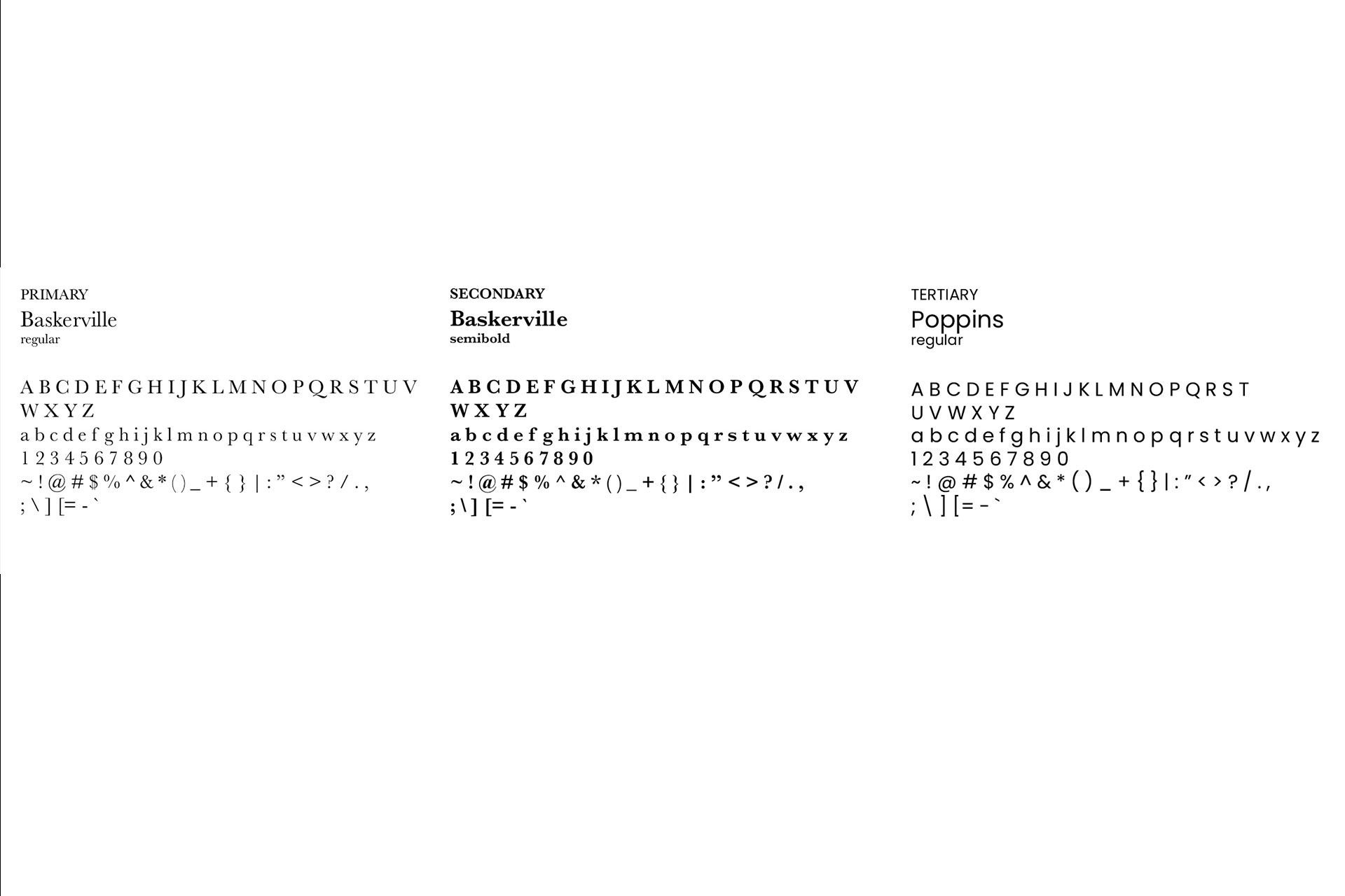
Bon Beauty's type system pairs Baskerville, used in both Regular and Semibold weights, as the brand's primary and secondary typeface for headlines and emphasis, with Poppins Regular as the tertiary typeface for body text — balancing Baskerville's classic, elegant character with the clean readability of a modern sans-serif.
Package
Design
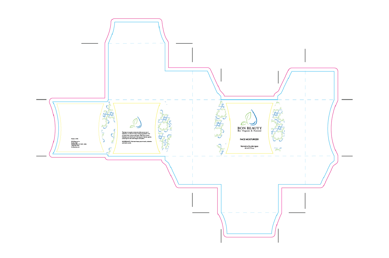
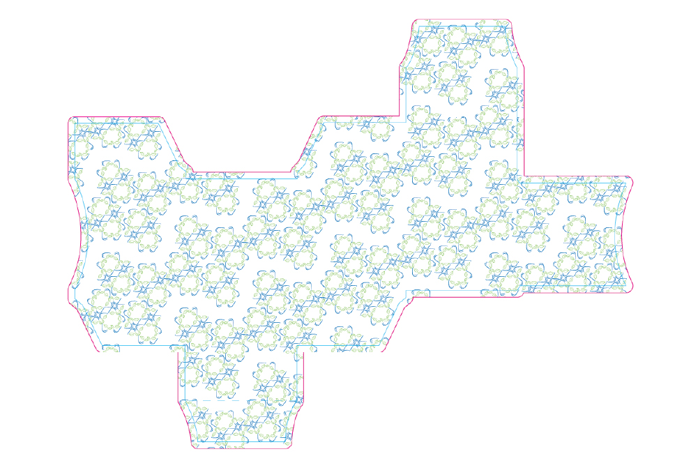
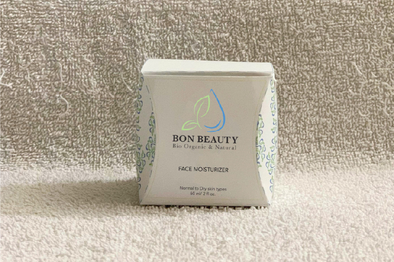
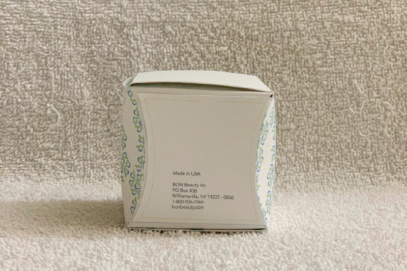
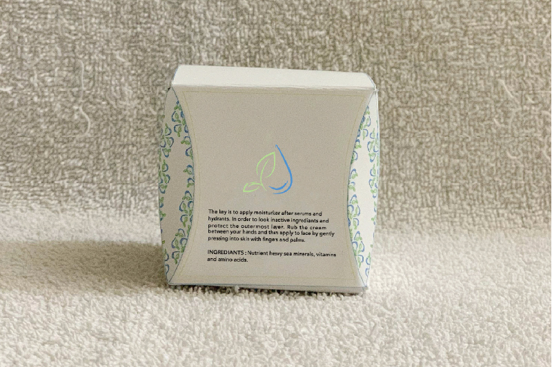
The moisturizer box takes its form from the body itself — the subtle dents at each corner echo the curves of body contours, while the surface pattern nods to molecular structure.
The
APP
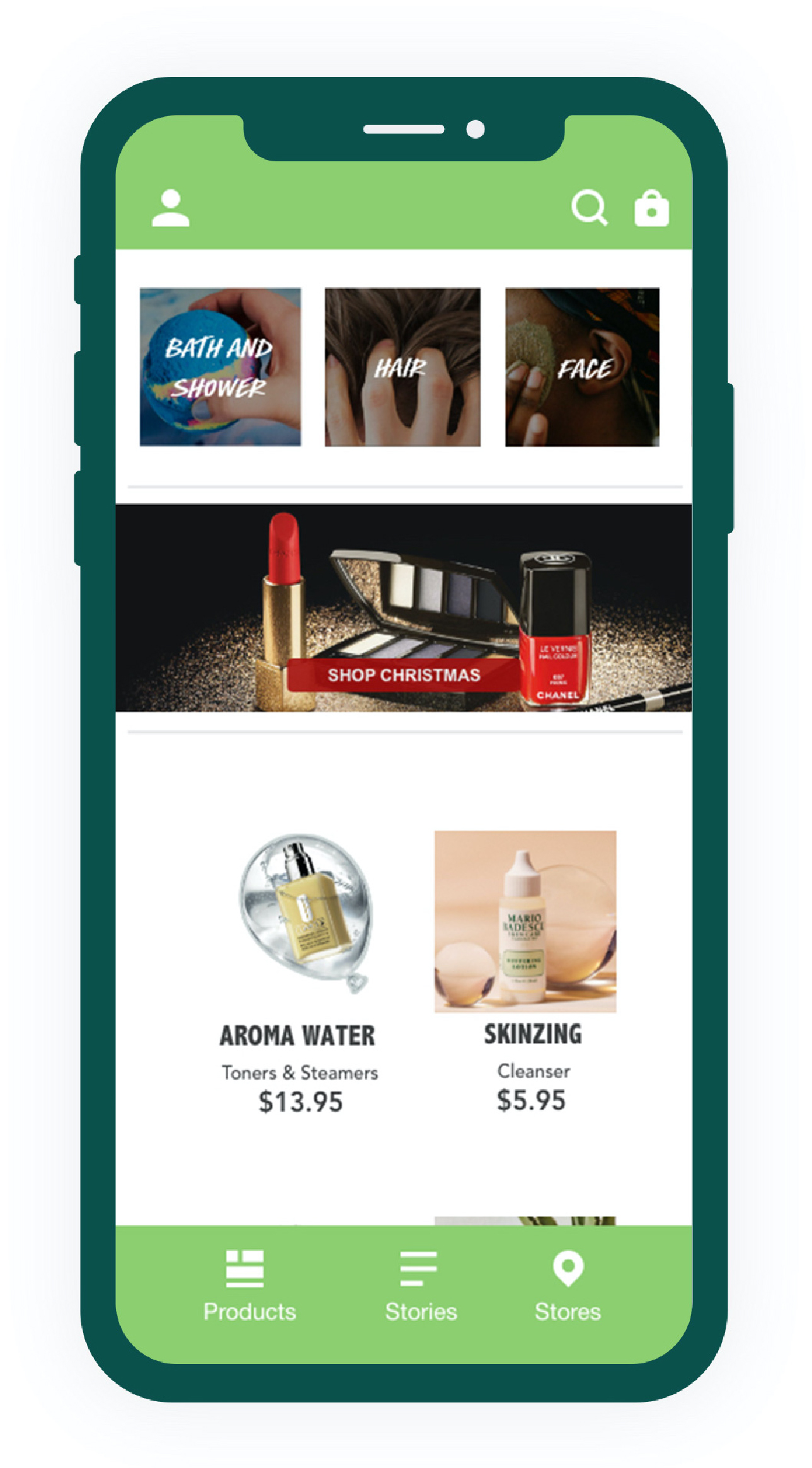
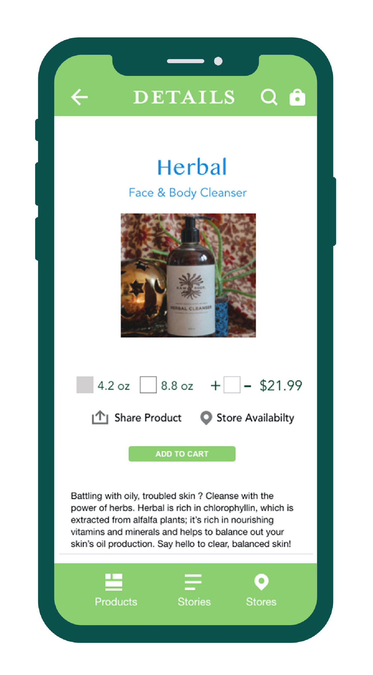
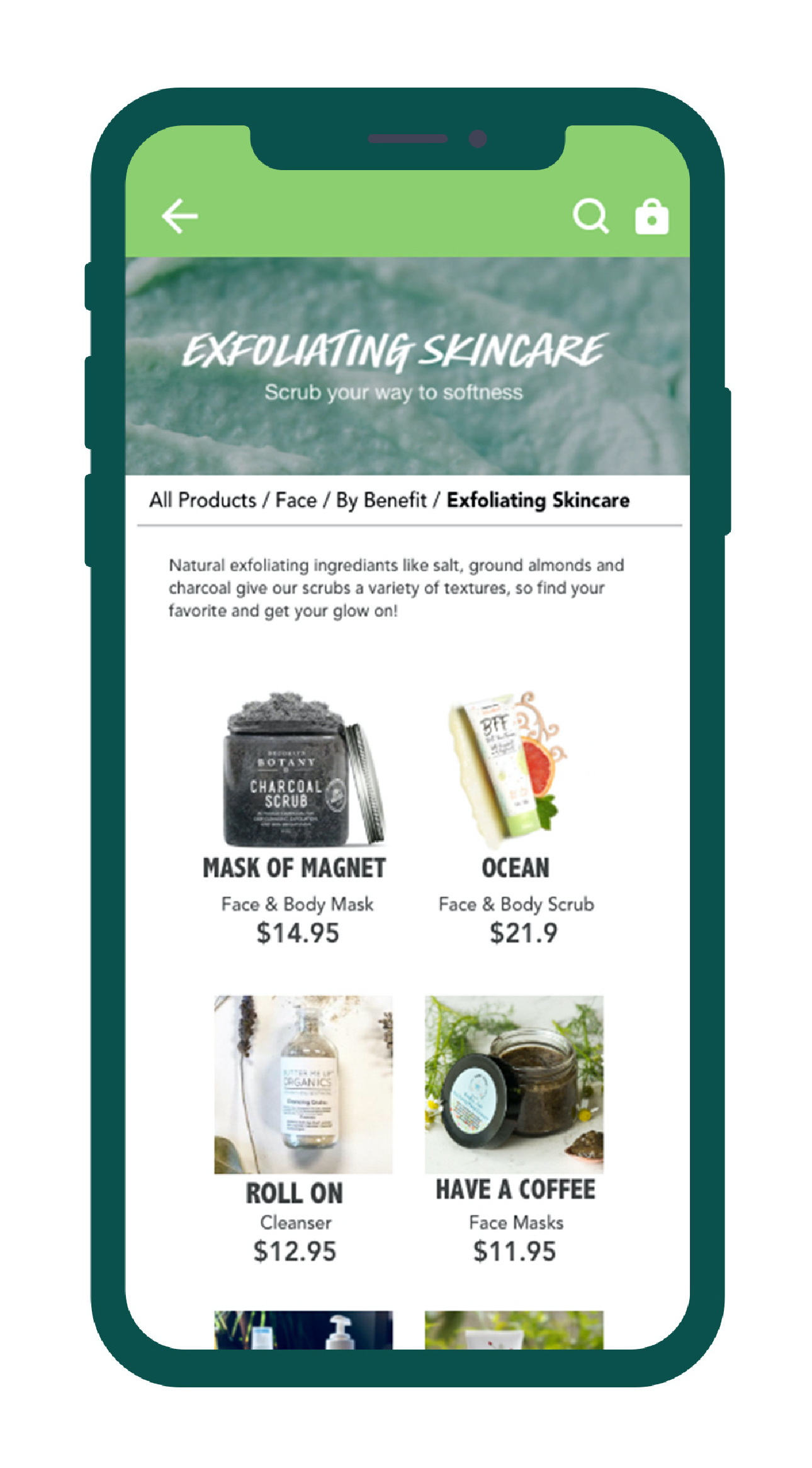
Available on iOS and Android, the app brings the fun, hands-on feel of shopping in store to your phone. With it, you can:
- Shop the full collection, from bath bombs and makeup to seasonal exclusives
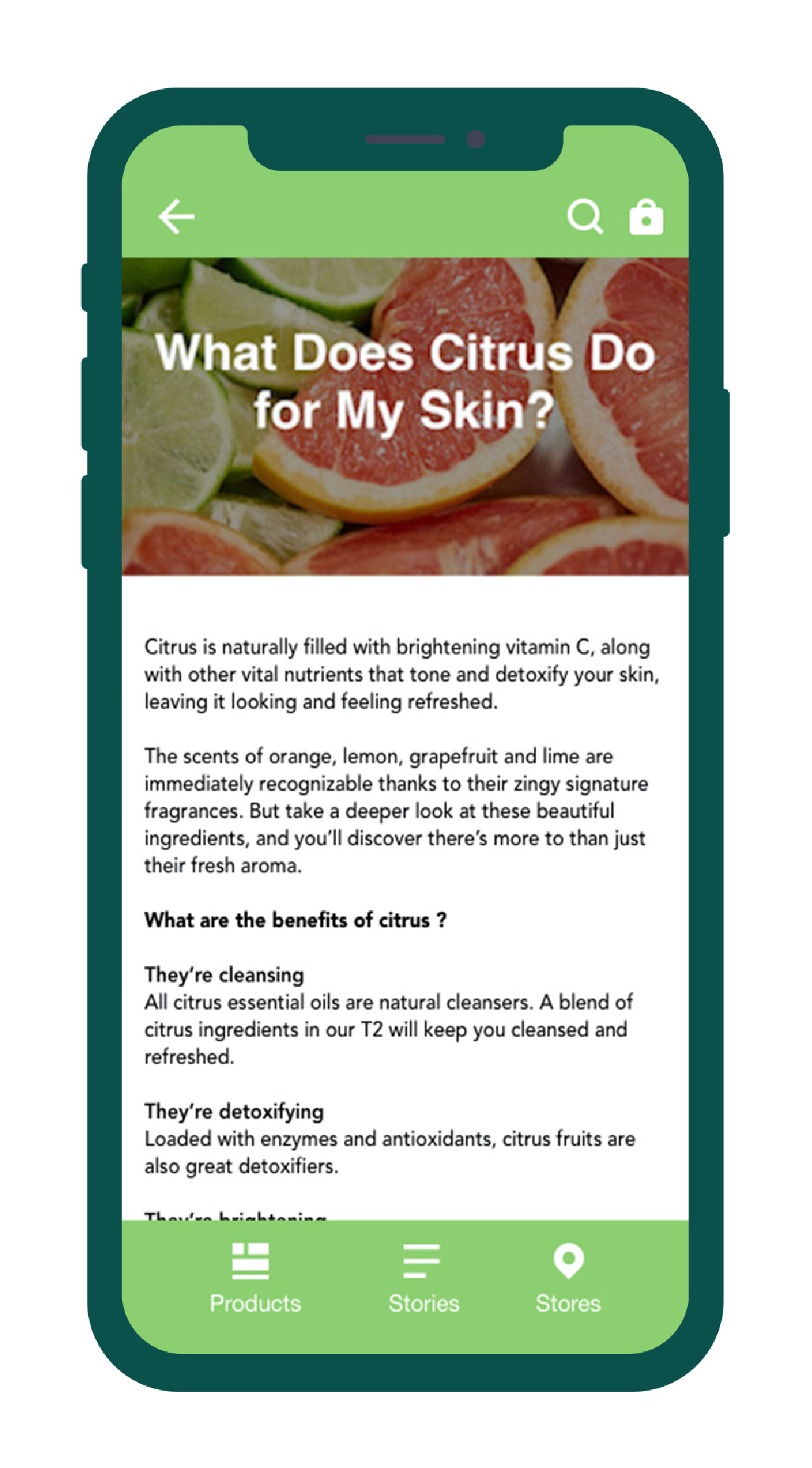
- Learn about our ethical sourcing, charitable work, and product innovation
- Browse by favorite scent or by the mood you're after
- Find your nearest store or search by postal code