
Patel Sweets
Made With Love
About the
Project
Patel Sweets was established in 2014 with a simple mission — to offer the finest quality sweets to our community. Over the years, we have earned a special place in people’s hearts through our commitment to quality, a wide variety of delicious sweets, and treats prepared with the utmost care and passion. Every bite is crafted with love and served with warmth.
-
IndustryConfectionery
-
MissionWe are dedicated to preparing fresh, festive sweets rooted in tradition and made with the finest quality ingredients, so we can be part of every happy and cherished moment for Indian families living in the USA and abroad.
-
TargetIndian sweets are cherished across generations and enjoyed by people of all ages. Children often have their favorite treats, while many adults love indulging in traditional desserts for celebrations and special moments. Sweets are also an essential part of weddings and events, making caterers an important audience as they frequently include dessert tables in their services.
Logo
Usage
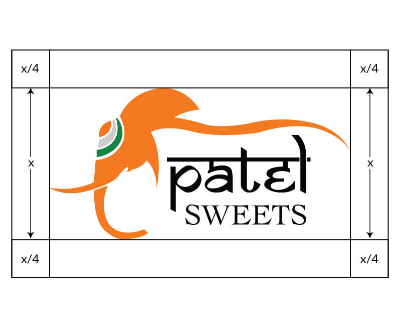
Since our company is an Indian sweet shop, we wanted our brand to reflect the richness of Indian culture and tradition. For centuries, the elephant has been admired in India as a symbol of wisdom, strength, and prosperity. Lord Ganesha, one of the most beloved deities in Hindu culture, is known as the remover of obstacles and the bringer of good fortune and success. Inspired by these meaningful symbols, we chose colors that celebrate our Indian heritage and the joyful spirit of our sweets.
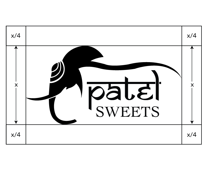
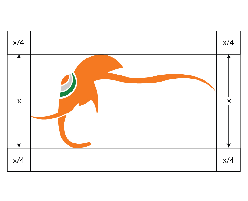
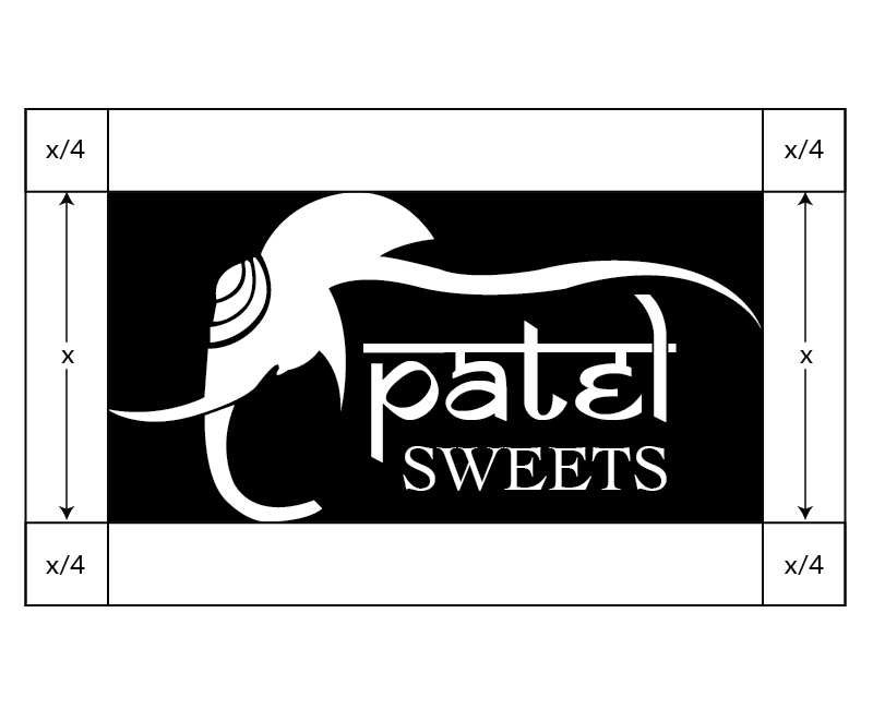
To maintain the logo’s visibility and impact, always surround it with sufficient clear space. No text, images, or graphic elements should enter this protected area. Clear Space (Live Area):
- Logo clear space: Live area = x/4 (where x is the logo height)
- Wordmark clear space: Live area = x/4 (where x is the logo height)
- The logo should never be used smaller than 0.5 inches in height.
Color
Palette
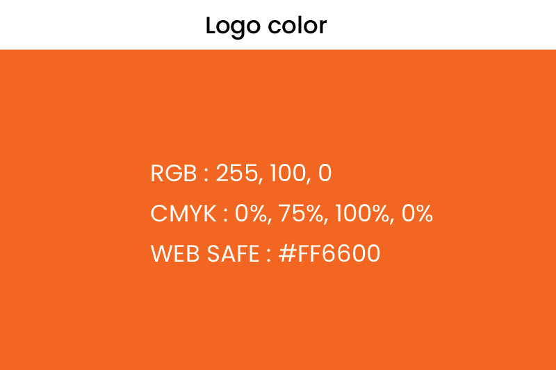
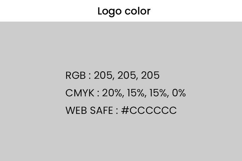
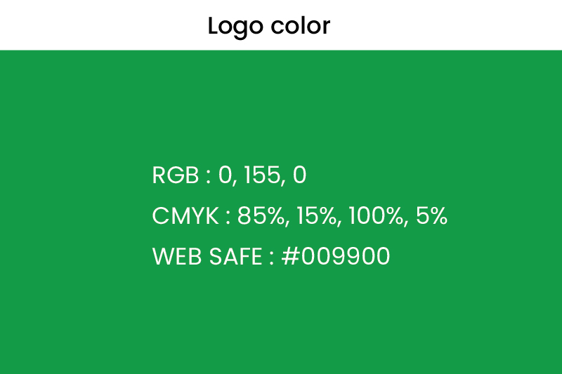
Orange, white, and green give the logo its distinctive Indian identity. These are the core brand colors and are most commonly used across collateral and packaging. The logo should always appear in the brand colors, black, or white. The white version may be used on solid-colored backgrounds. In some cases, the icon or the text may be used independently in communications, but in all other situations, the full logo must be displayed.
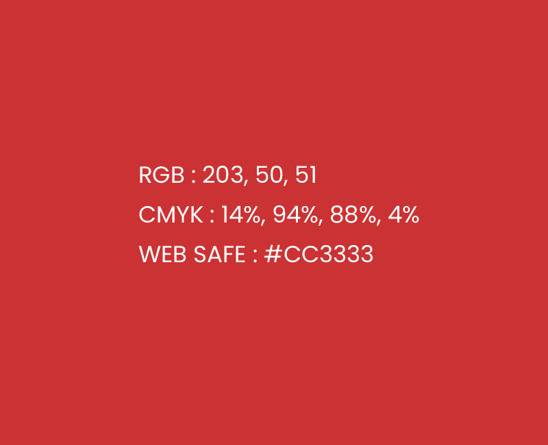
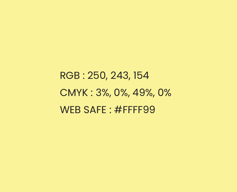
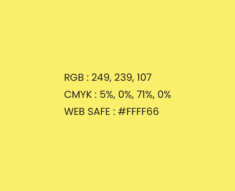
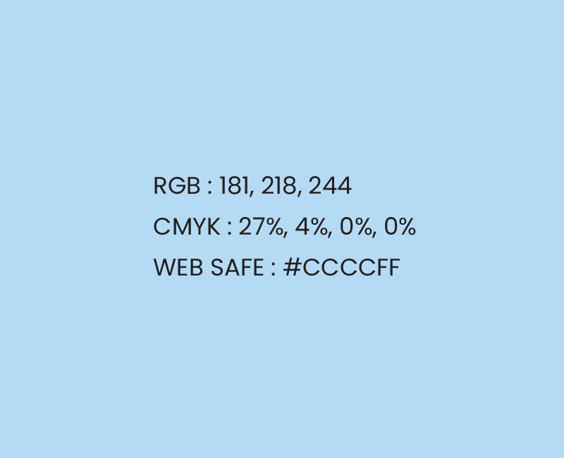
The secondary palette adds warmth and variety to the core brand colors. Rich red, deep plum, and navy blue bring depth and a festive feel. Soft yellows, blush pink, dusty mauve, and sky blue keep the look light and playful. Each packaging line can use its own color combination while staying part of the Patel Sweets family.
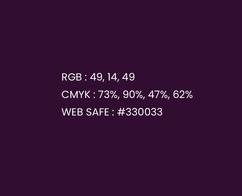
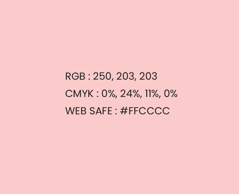
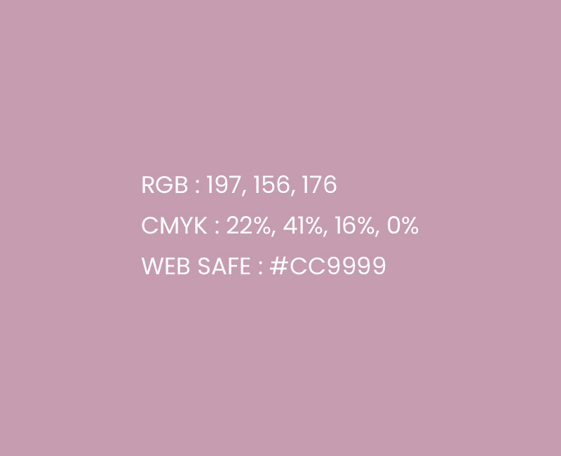
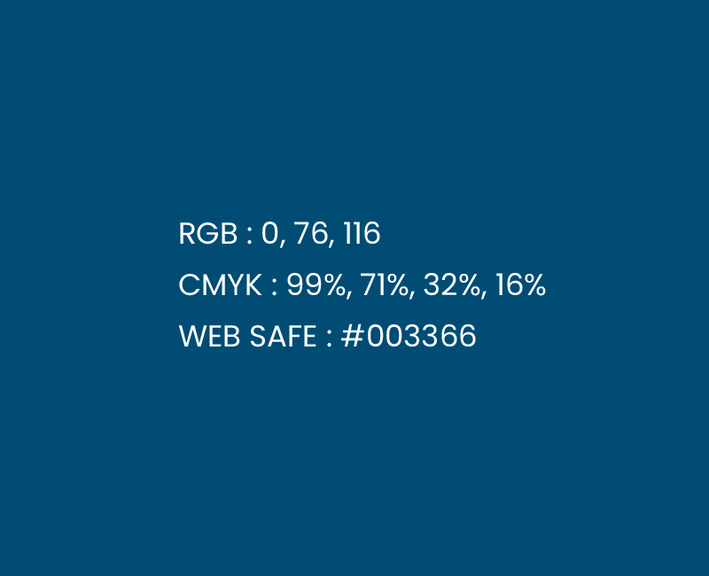
Typography
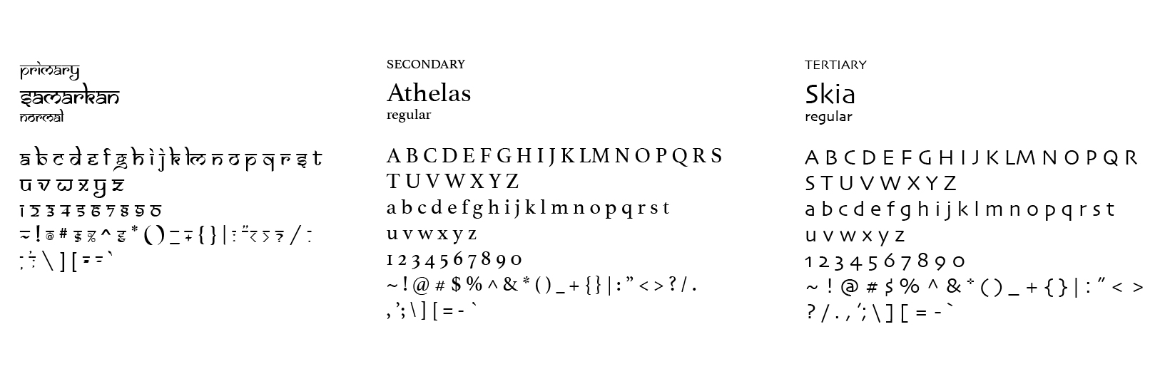
The greatest aspect of Athelas typeface is the nice, crisp look that it possesses and how it does not impede on what is surrounding it while also managing to stand out and look appealing to the eye. Skia is a stylish sans serif typeface and has variable weight and width axes. The font includes old-style numerals, inferior and superior numbers and letters, fractions, and ligatures, demonstrating the richness of character set that such fonts can contain.
Package
Design
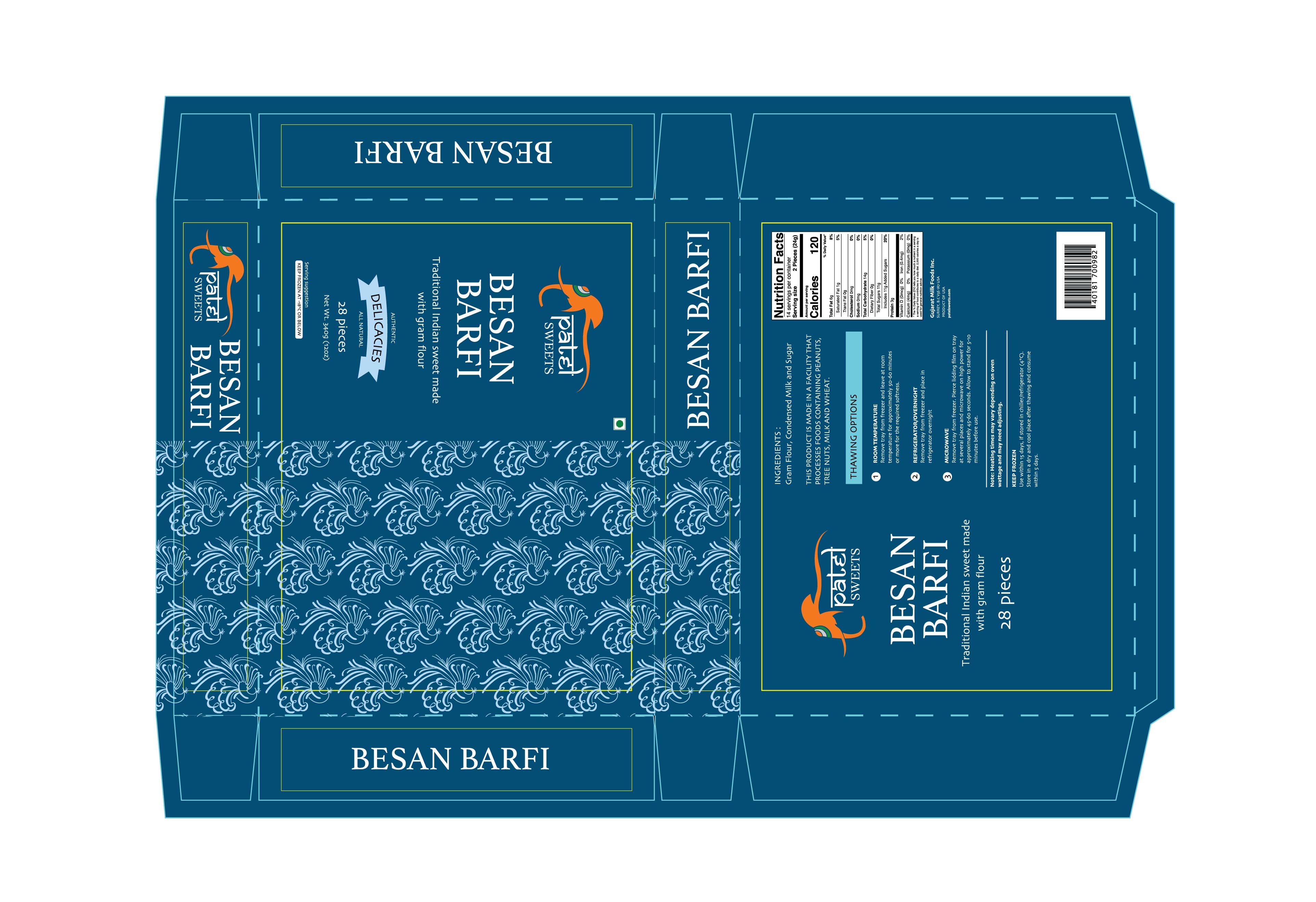
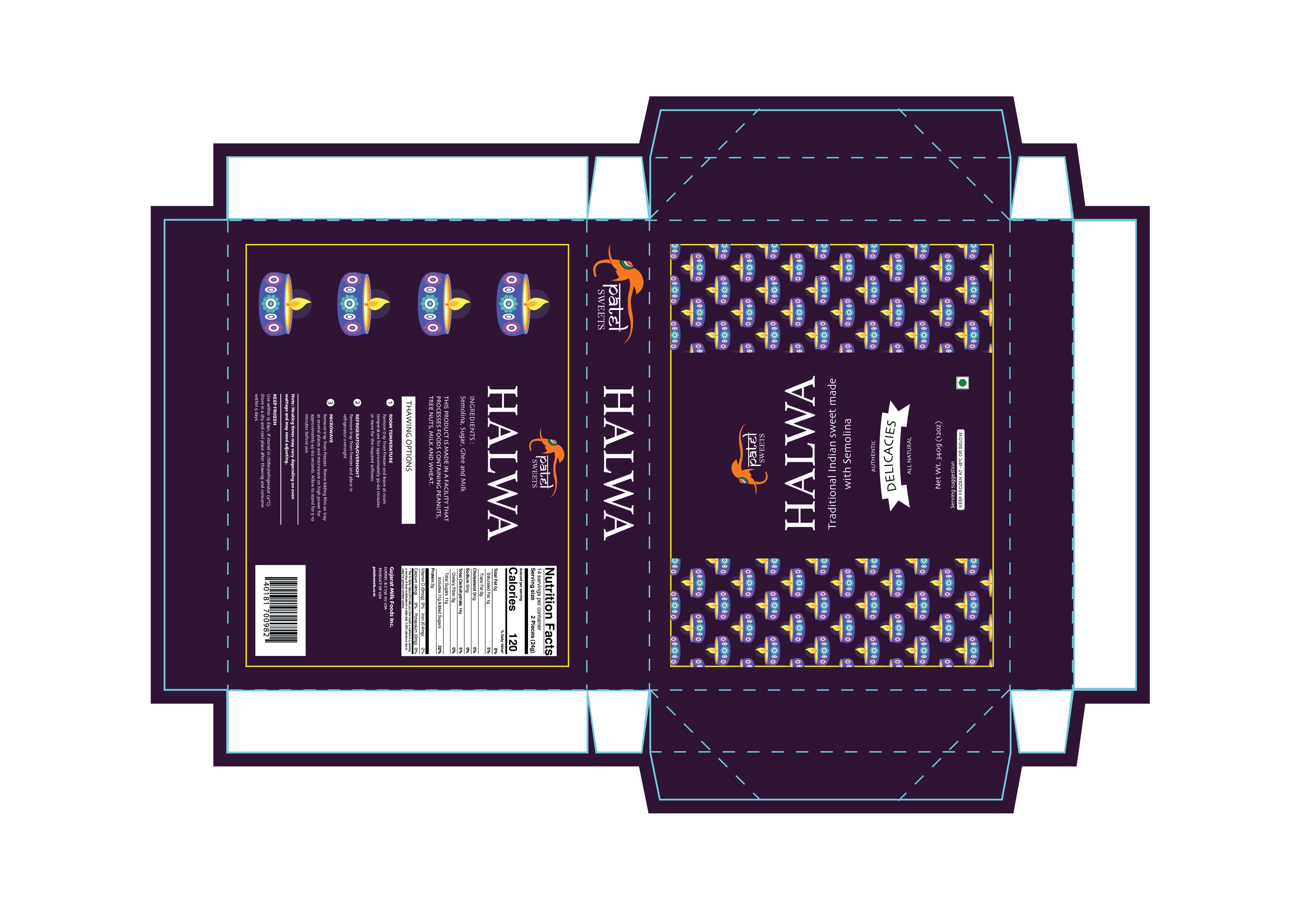
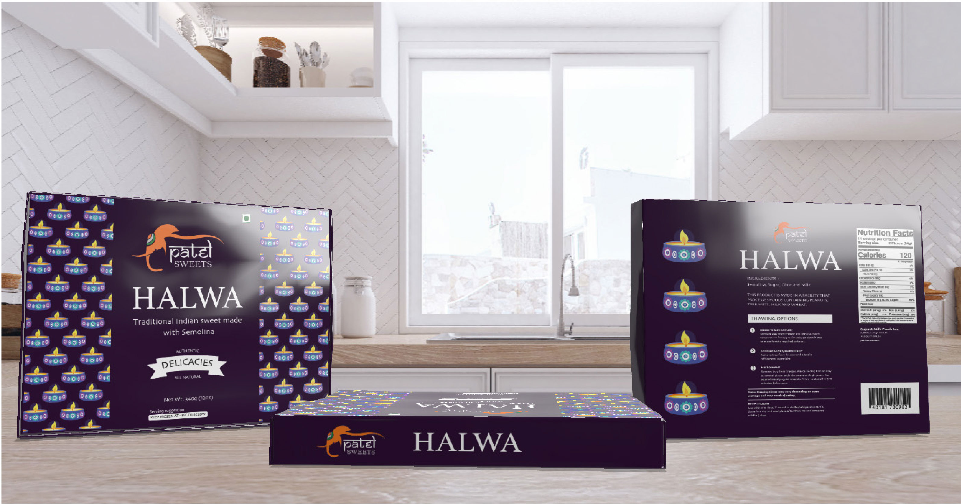
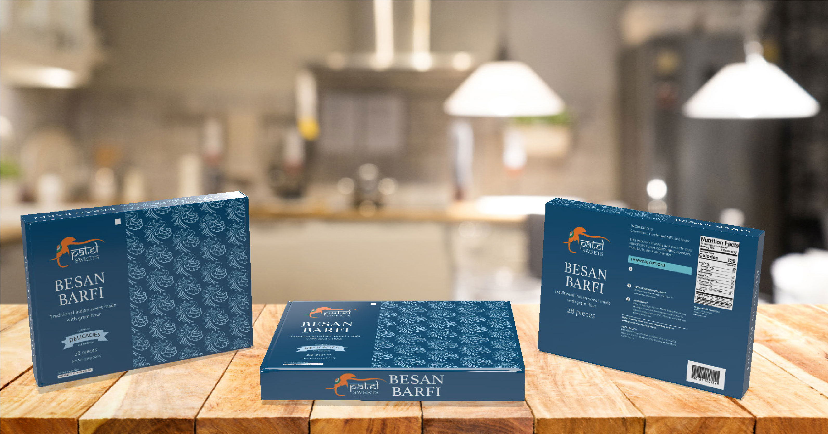
In India, sweets play a vital role in festivals, celebrations, and every happy occasion, and most traditional Indian sweets are made using milk or ghee as key ingredients. With more than 80 varieties of sweets across the country, I chose two of my favorites to focus on for my packaging design project: Besan Barfi for seasonal boxes and Halwa for festive boxes.