
Pure Psychiatry
A Clear Mind
About the
Project
Pure Psychiatry is a privately owned psychiatry and counseling group treating patients of all ages across Michigan and Ohio. It offers medication management, therapy and counseling for anxiety, depression, ADHD, bipolar disorder, PTSD and more.
The practice sets itself apart with personalized treatment plans, fast access to care — new appointments within 7 days — and warm, judgment-free offices designed to feel welcoming rather than clinical.
-
IndustryMental health care
-
RoleLogo design & custom lettering (freelance)
-
ToolsAdobe Illustrator
-
MissionHelp patients feel like themselves again through personalized, timely psychiatric care.
-
TargetNew patients and families seeking care, plus referring doctors, hospital partners and insurers.
Live at purepsychmi.com
The
Challenge
The practice needed a logo that makes reaching out for mental health care feel less intimidating: modern and memorable, warm rather than clinical, and built around its name.
- Stigma: mental health branding can feel cold or alarming; this one needed to feel human and hopeful.
- Trust: it appears next to 17 insurance logos on the homepage, so it had to hold its own as a professional healthcare mark.
- The name: "Pure" suggests clarity and calm, but risks reading as a spa or cleaning product without the right cues.
- Range of sizes: it has to read clearly both as a large website header and as a tiny social profile picture.
Research
Mental health logos tend to repeat the same few symbols — brains, heads with puzzle pieces, generic leaves and hands — usually in clinical blues and greens. I wanted to avoid those clichés while keeping the idea of a person and their mind at the center.
Keywords that guided the work: clarity, calm, hope, human, openness, light.
- New patients need to feel safe, unjudged and hopeful.
- Parents booking for children need trust, competence and warmth.
- Referring doctors & hospital partners need professional credibility.
- Insurers & job candidates need to see an established, legitimate practice.
Process
- Discovery — learned about the practice: its services, its patients, and the welcoming, judgment-free experience it wanted to offer.
- Exploration — explored ideas around the person, the mind, and the name "Pure" before settling on a face in profile.
- Concept — joined the profile and the letter P into one continuous line, so the head and the initial became a single shape.
- Lettering — drew a custom PURE wordmark sized to sit inside the head.
- Refinement & delivery — tuned line weights, tapers and color, then delivered the final logo files to the client.
Concept
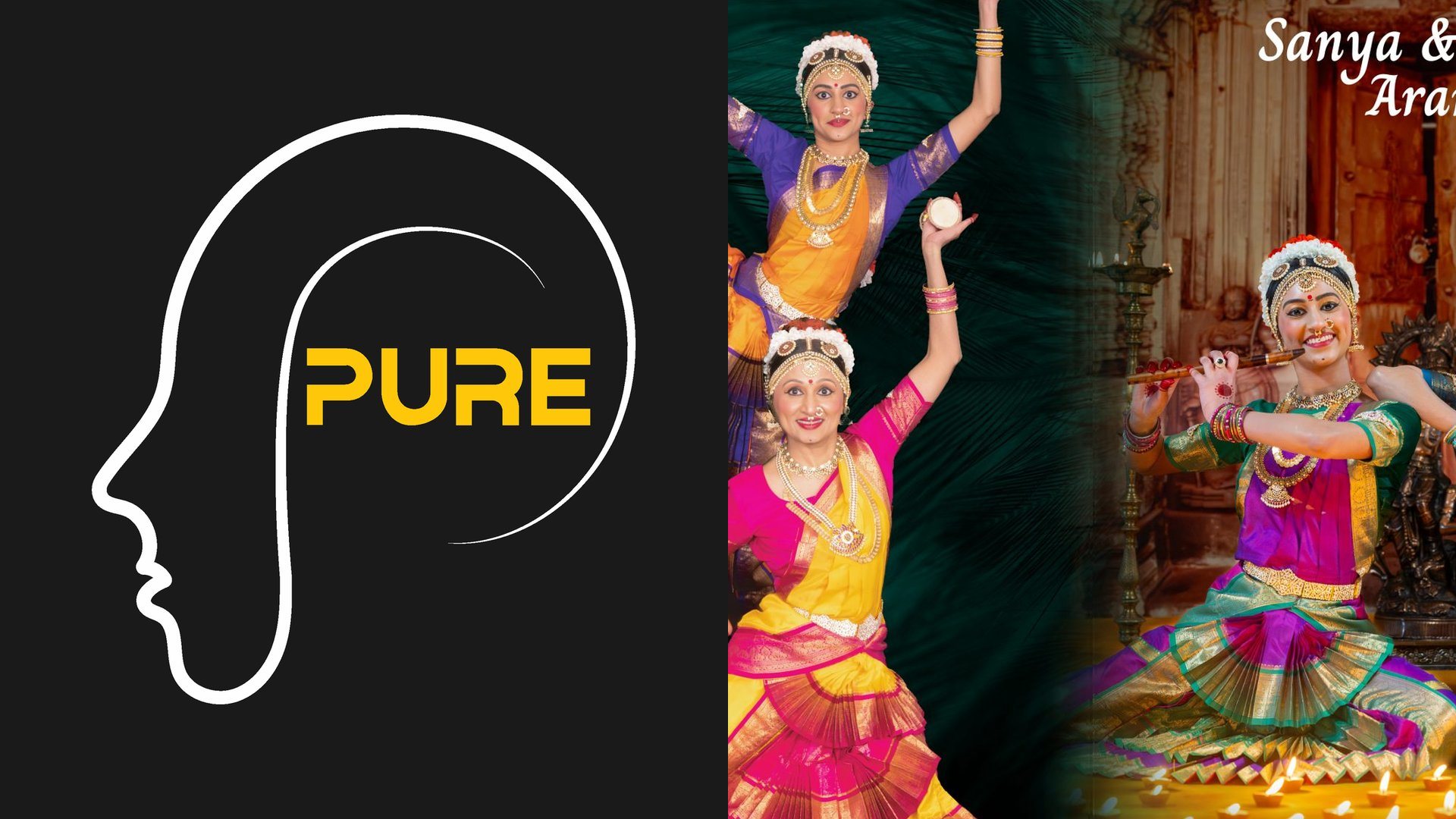
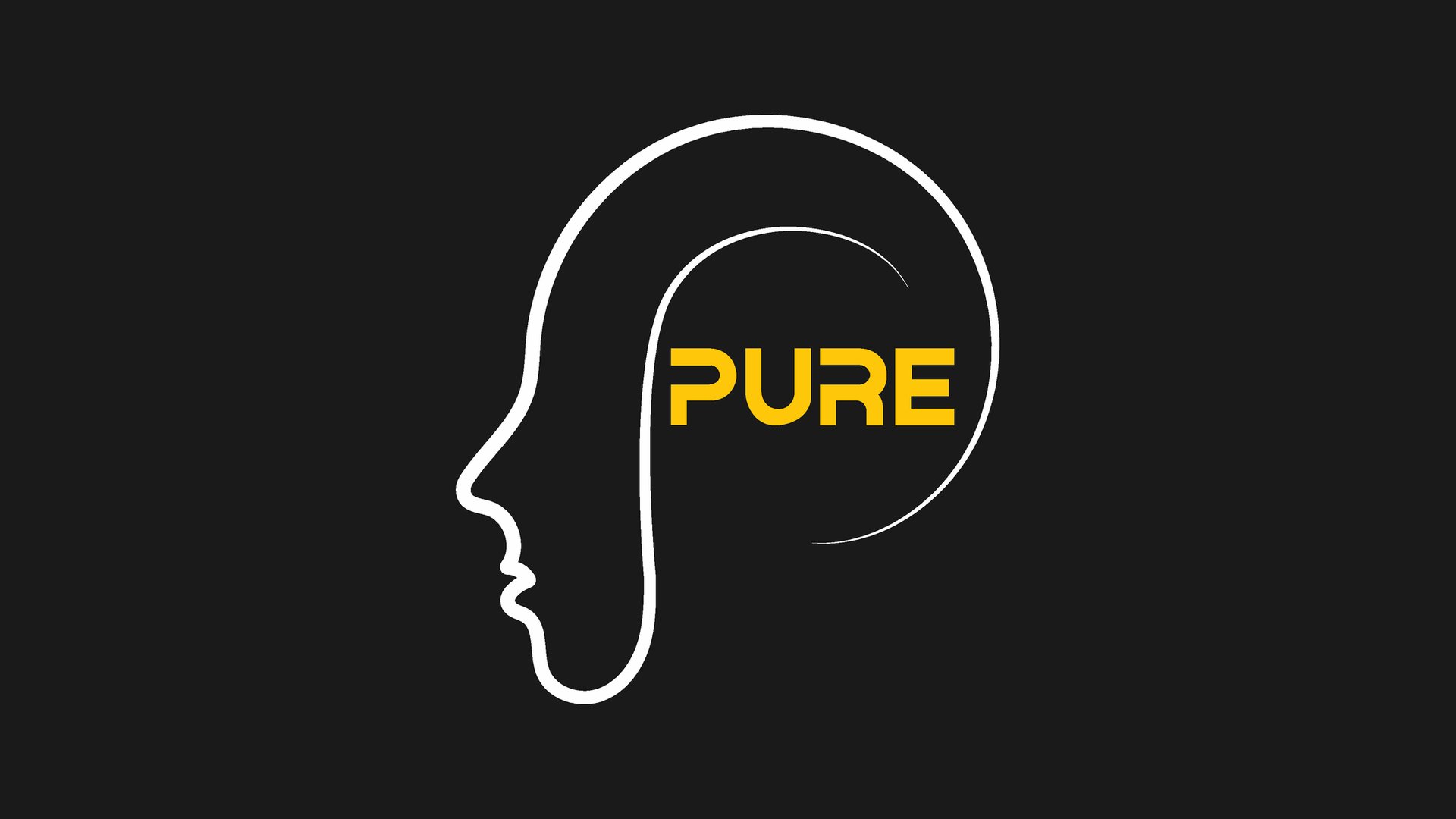
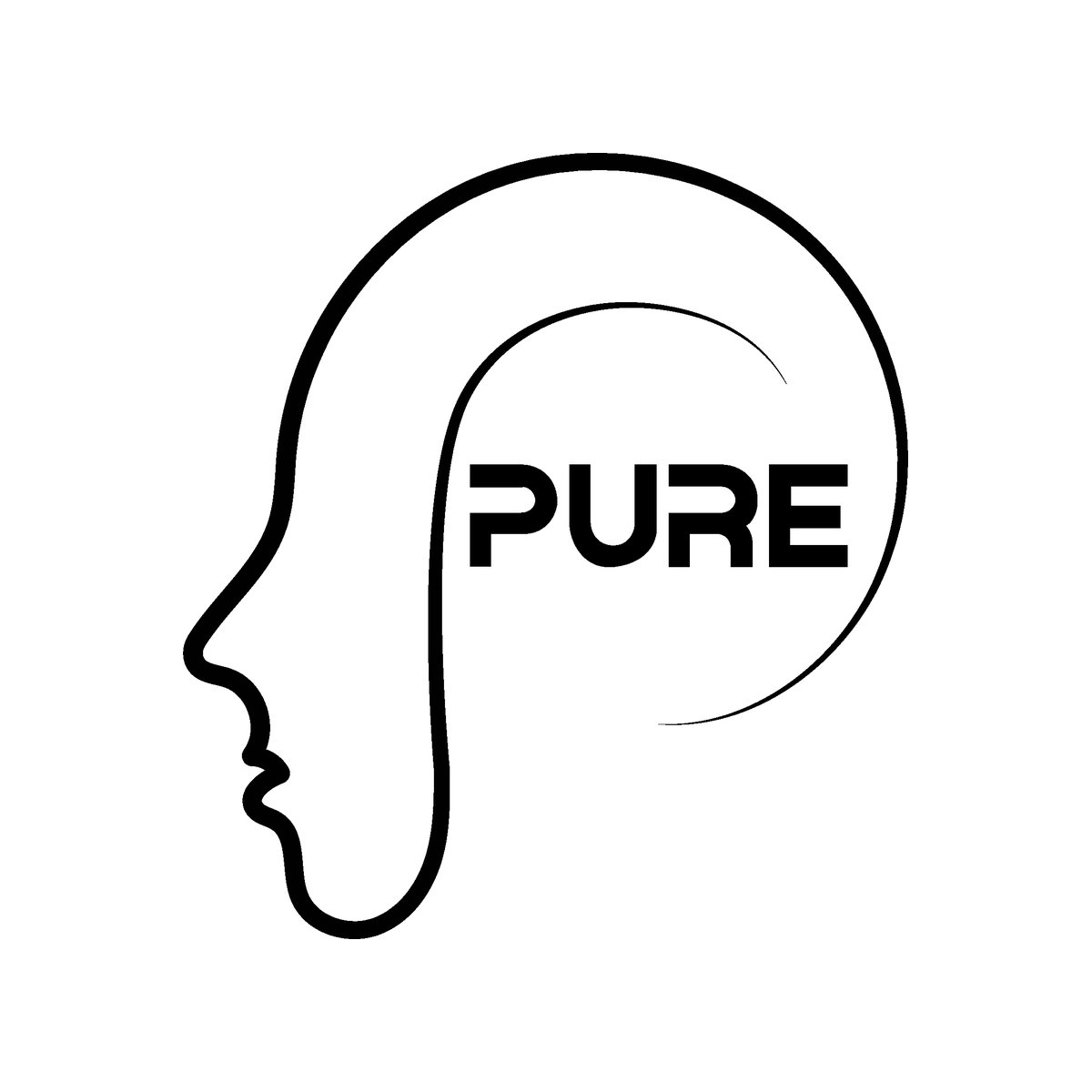
A single continuous line draws a face in profile, then sweeps up and around the head to become the letter P — the person and the practice in one stroke, with the word PURE sitting exactly where the mind is.
- The profile: forehead, nose, lips and chin drawn as one unbroken line — a calm, forward-facing person instead of a clinical symbol.
- The P: the back of the head curls into the bowl of a P, so the practice's initial and the human figure are the same shape.
- The tapering strokes: the outer loop and inner curve thin to a hairline as they finish, like tension easing and heavy thoughts lightening.
- The open loop: the circle never fully closes, leaving room — care as an ongoing, open process rather than a closed box.
- PURE inside the head: the wordmark fills the space of the mind, making a clear mind the outcome the logo promises.
Logo
Versions
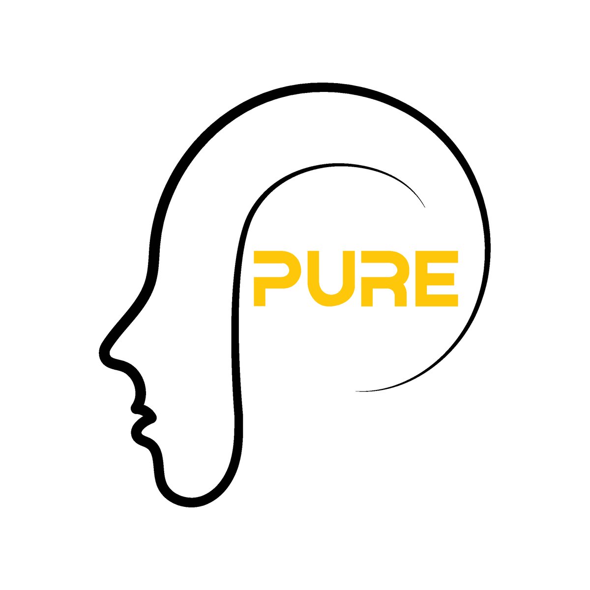
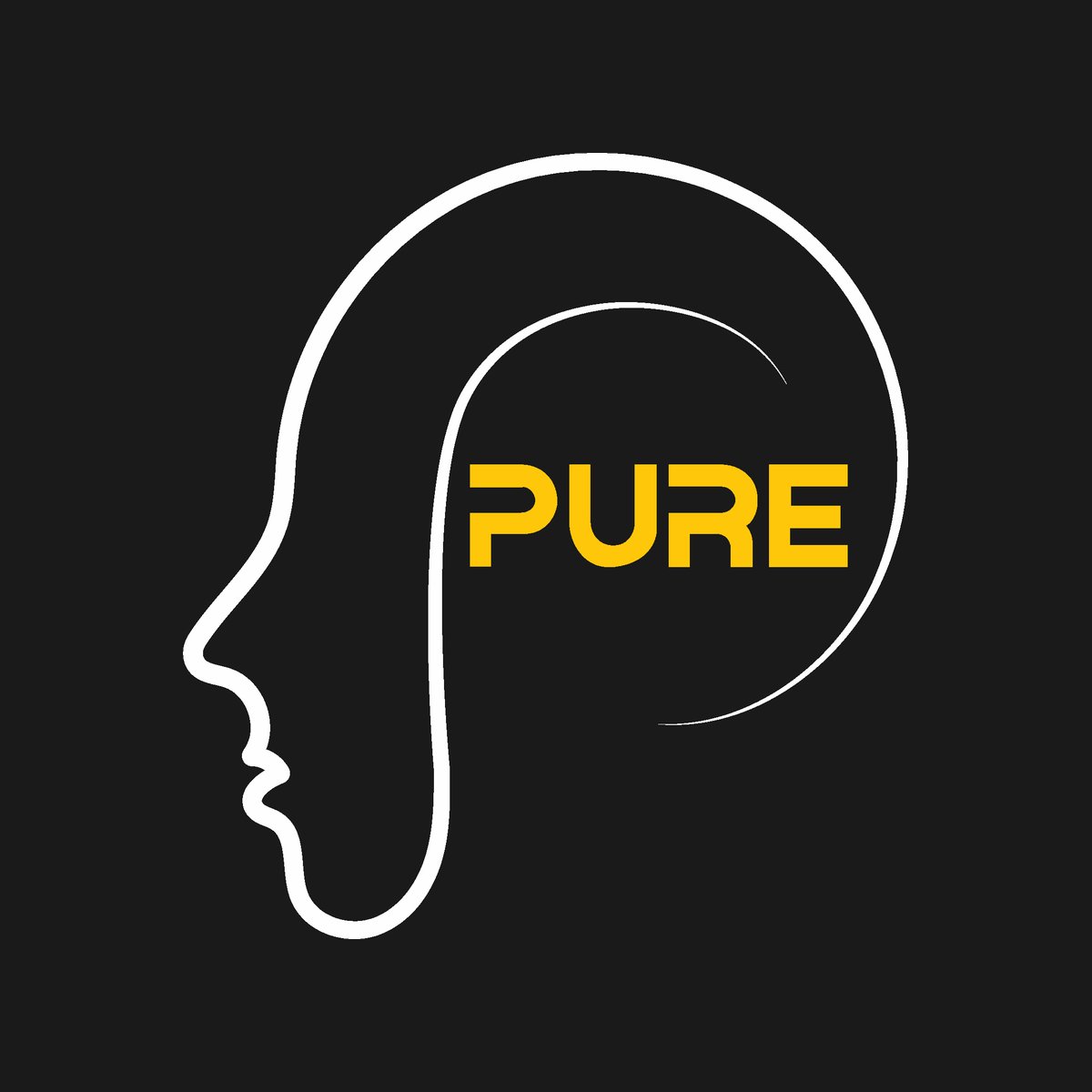
Use the full-color logo whenever possible. Switch to the reversed version on dark backgrounds, and to one-color black only when color printing isn't available. The symbol and wordmark always appear together — never separate or rearrange them.
Logo
Usage
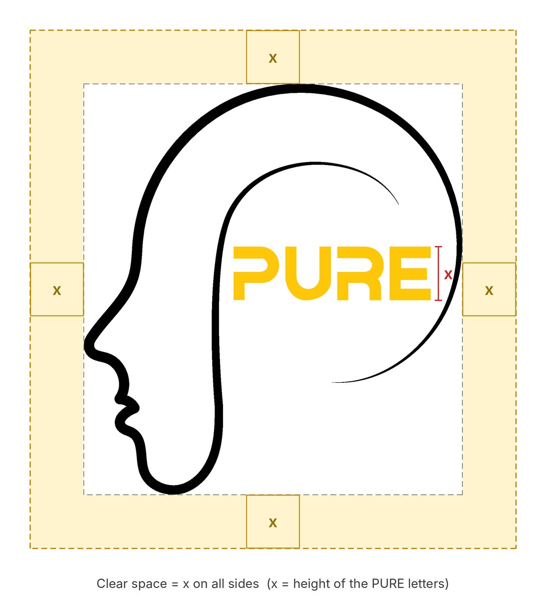
To keep the logo clear and impactful, always surround it with enough clear space. No text, images or graphic elements should enter this area. Clear Space (Live Area):
- Clear space = x on all sides (where x is the height of the PURE letters, about 14% of the logo's width)
- Minimum width: 120 px on screen, 1 inch (25 mm) in print
- Below these sizes the thin, tapering line ends disappear and the letters become hard to read.
Color
Palette
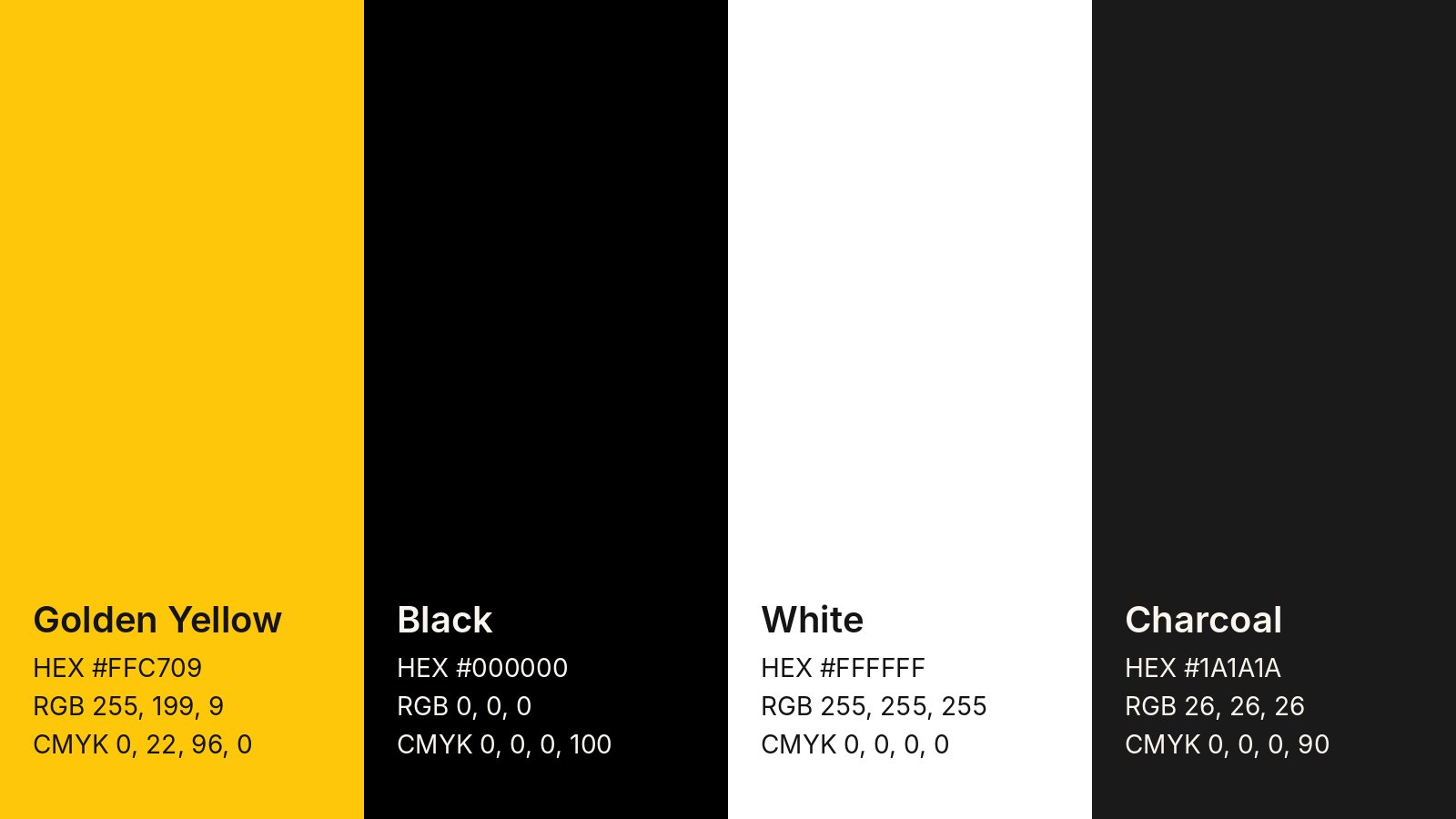
Two colors carry the brand: black for the line art and golden yellow for the wordmark, with white and charcoal as backgrounds. Most healthcare brands lean on blues and greens; the warm yellow brings optimism and light, and helps Pure Psych stand apart.
Keep yellow as an accent, never a large background behind the logo — the wordmark disappears on it. For spot-color printing, the closest Pantone match to Golden Yellow is 7548 C; confirm it against a printed swatch before going to press.
Typography
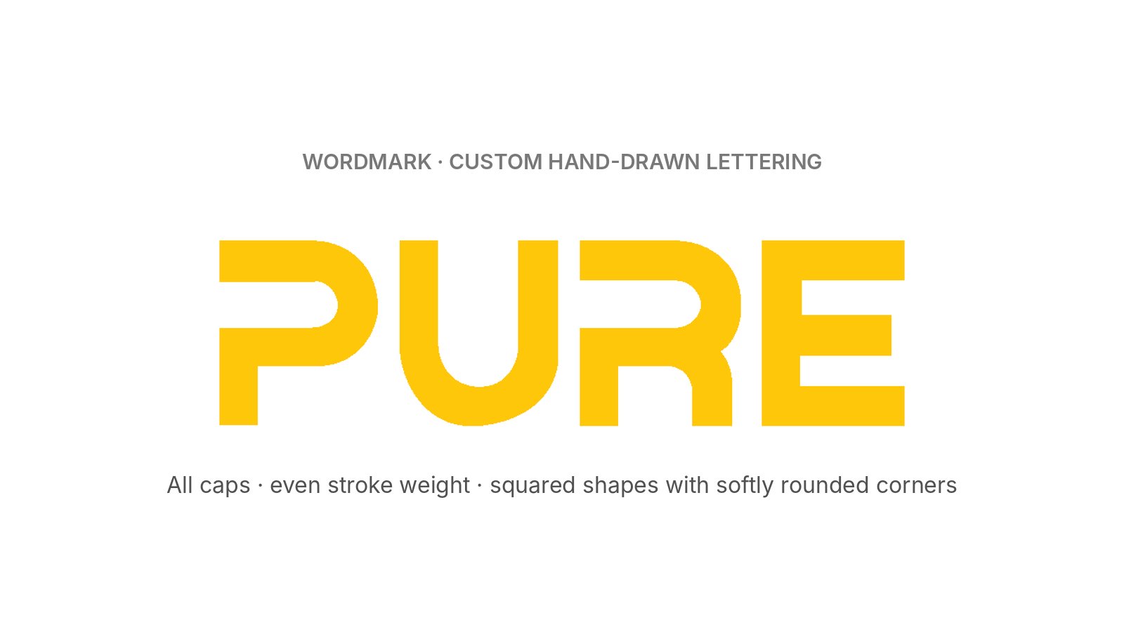
The PURE wordmark isn't set in an existing typeface — I drew each letter by hand. The letters share one geometric system: all caps, an even stroke weight, squared shapes with softly rounded corners, and flat cut ends on the P and R. The heavy, uniform letters contrast with the fluid, tapering line around them: the structure of evidence-based care inside a human, organic shape.
For supporting text, I recommend Montserrat SemiBold for headings and Open Sans Regular for body copy — free Google Fonts whose geometric shapes echo the wordmark. Never retype "PURE" in a font; always use the logo artwork.
Logo
Misuse
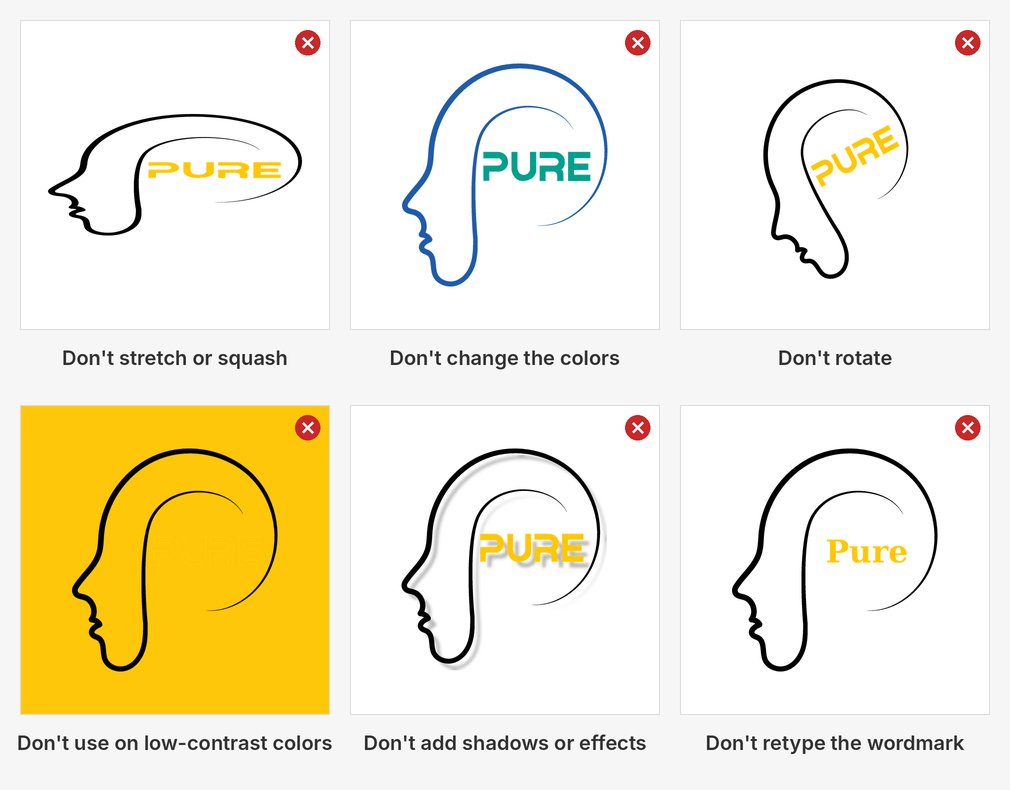
Any change to the logo weakens it. Don't stretch, recolor, rotate, add effects, retype the wordmark, or place the logo on low-contrast colors. Also avoid separating the symbol from the wordmark, placing it over busy photos, adding outlines, or using low-resolution copies.
Tone of
Voice
Pure Psychiatry speaks the way the logo looks: calm, warm and clear. Words should make reaching out feel easier, never more intimidating.
- Warm, not clinical: "We're here to help you feel like yourself again."
- Clear, not full of jargon: "Most new patients are seen within 7 days."
- Hopeful, not alarming: "Healing takes time, and you don't have to do it alone."
- Respectful, not judgmental: "Every person's needs are different, so every plan is too."
Outcome
The practice has grown from its Michigan base into Ohio, and the logo has scaled with it — still the face of the brand across both states. It appears in the header and footer of purepsychmi.com, on its Instagram, Facebook and YouTube profiles, and on the link preview whenever the site is shared.
- What I learned: designing for a sensitive audience means every choice should lower anxiety — friendly shapes, warm color, nothing clinical or alarming.
- What I'd do next: extend the mark into a full brand kit — an icon-only version for favicons, social post templates, and patterns built from the line work.