

Desi Gehna
Crafted Legacy
About the
Project
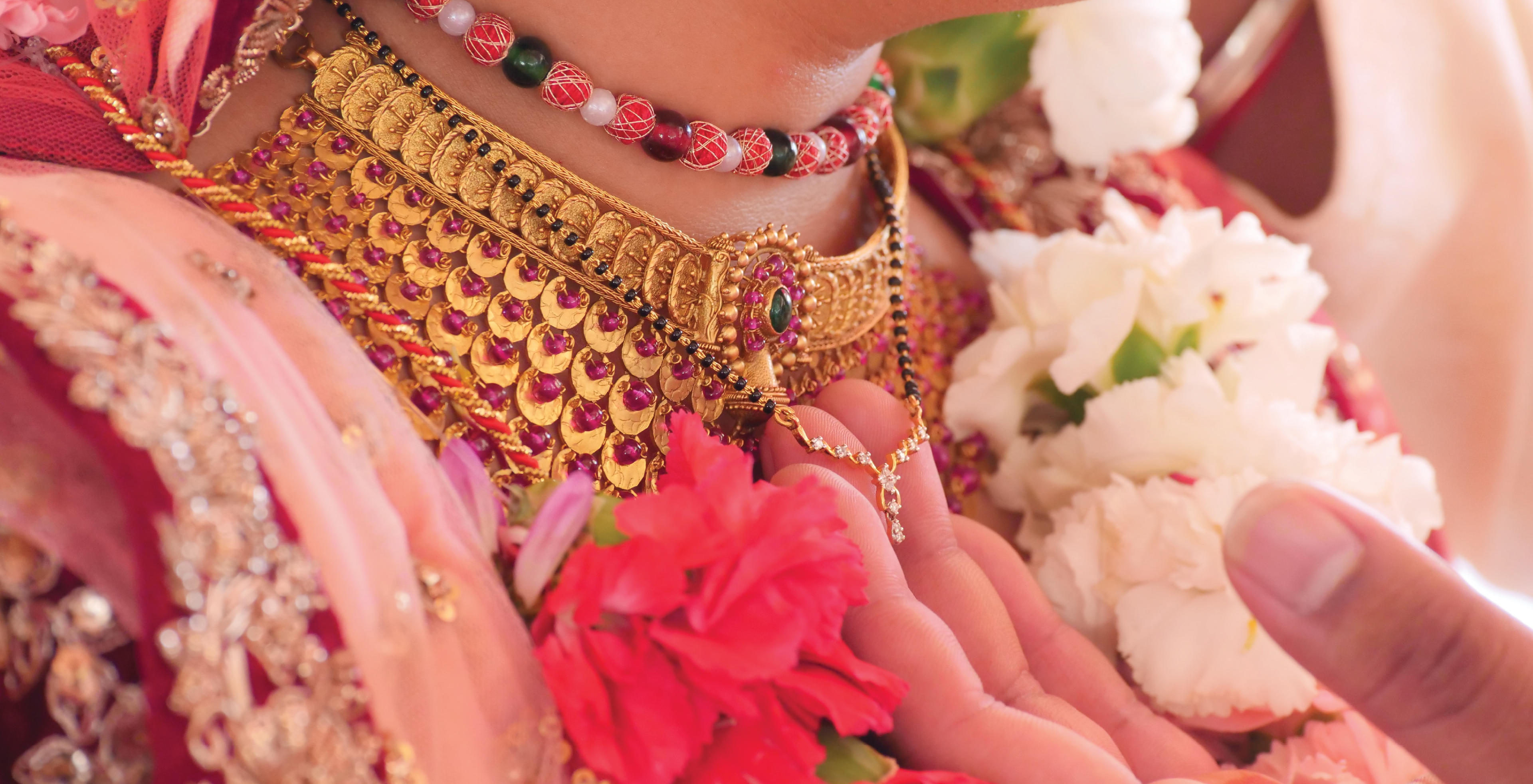
Desi Gehna Jewellers is one of the most trusted and respected jewellery brands, with seven showrooms across India and the United States, all owned and operated under a single management. Our remarkable growth reflects the loyalty and confidence our customers have placed in us for generations. We are proud to continue building a legacy of quality, craftsmanship, and trust that spans across the world.
-
IndustryIndian jewelry
-
MissionWe aim to delight every customer with fresh flavors, wide variety, great value, and heartfelt service. By listening to our community and constantly evolving, we work to create a truly memorable vegetarian food experience.
-
TargetWe cater to men and women in the upper-middle to upper class, across the 21–55 age group. Our collections are thoughtfully designed for every occasion — from everyday elegance to grand wedding celebrations. To celebrate men’s style, Desi Gehna Jewelers proudly features an exclusive men’s jewelry line called NAR, created to offer sophisticated and distinctive pieces for the modern man.
Research
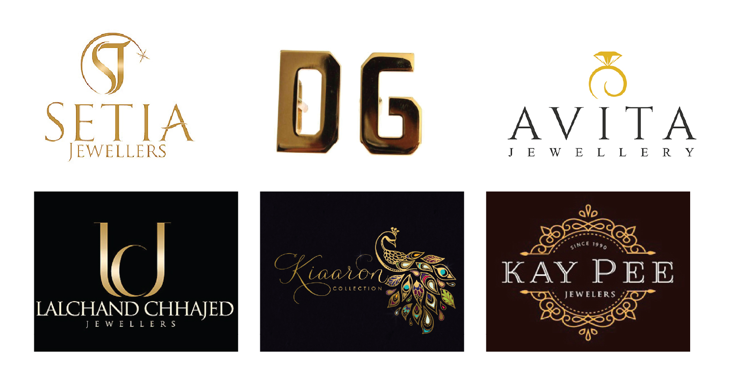
While researching jewelry brand logos, I noticed that many of them feature ornamental elements. I wanted to take a different approach and create something more distinctive. That’s when I explored the idea of using the initials “DG” and focused on typography as the main symbol, rather than adding extra decorative elements.
Sketches
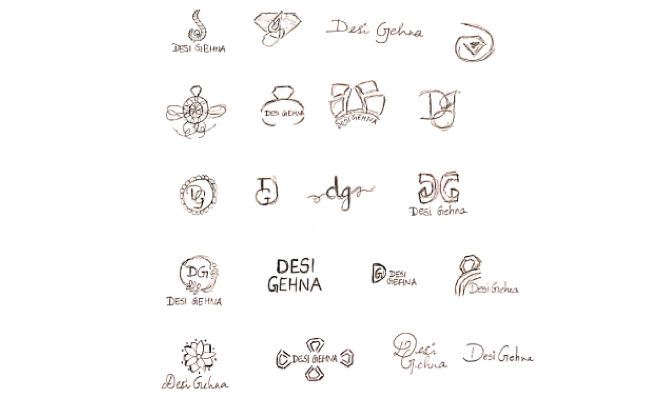
I started the Desi Gehna identity by hand-sketching more than 20 logo concepts. The ideas covered DG monograms, script wordmarks, and icons drawn from gemstones, rings, and floral motifs. These early explorations helped me find the balance between traditional Indian jewelry heritage and a clean, modern feel. They guided the direction for the final logo.
Logo
Usage
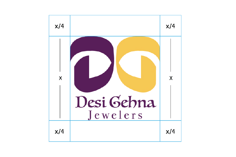
To maintain the logo’s visibility and impact, always keep it surrounded by sufficient clear space. No text, images, or graphic elements should enter this area. Clear Space (Live Area):
- Logo clear space: Live area = x/4 (where x is the logo height)
- Wordmark clear space: Live area = x/2 (where x is the logo height)
- The logo should never be used smaller than 0.5 inches in height.


Color
Palette
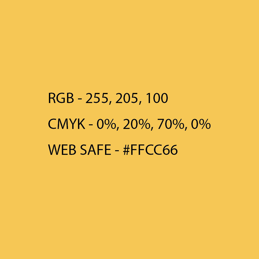
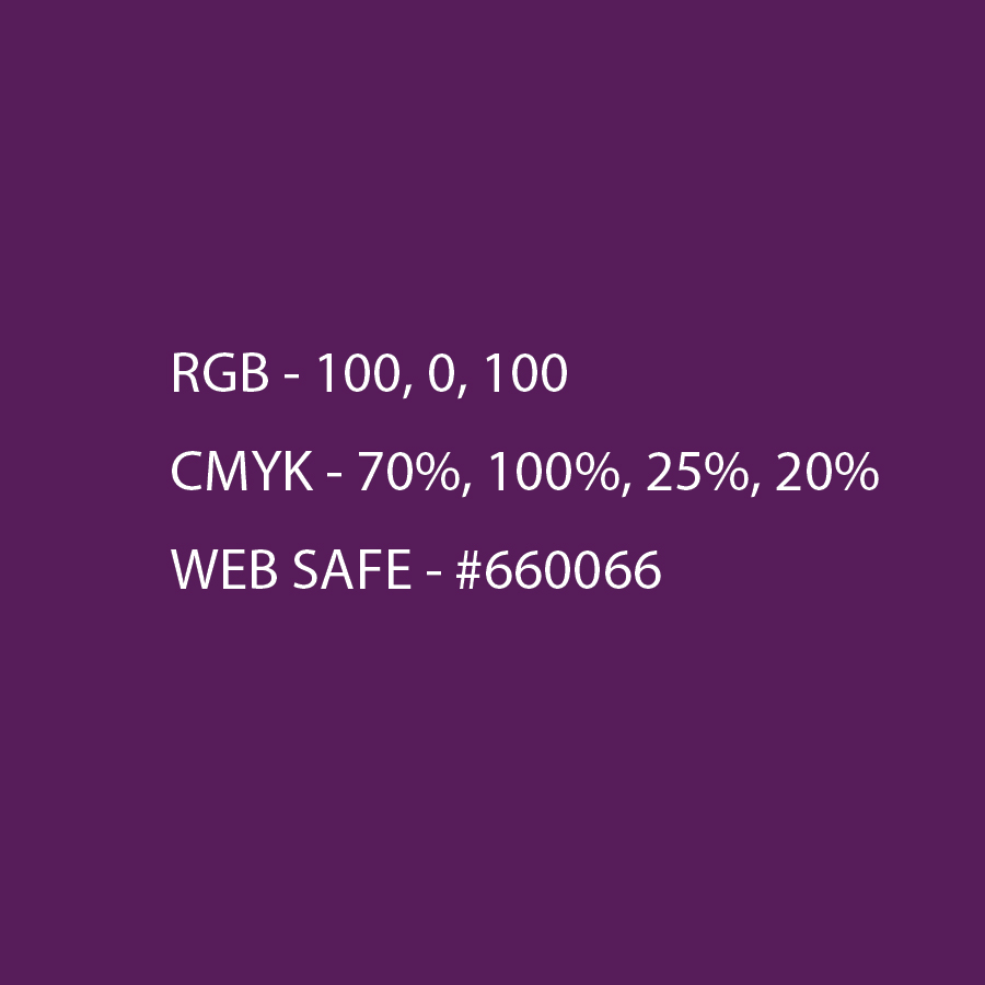
These are the primary brand colors used in the logo and across most brand materials. They form the core visual identity of the brand and should always be used in their original form—no changes in hue, saturation, or tints are permitted, as this goes against our brand standards. The combination of purple and yellow represents luxury, boldness, and confidence. Purple is traditionally associated with royalty and elegance, while yellow brings energy, cheerfulness, and vibrancy. Together, they create a distinctive and confident brand presence.
Typography
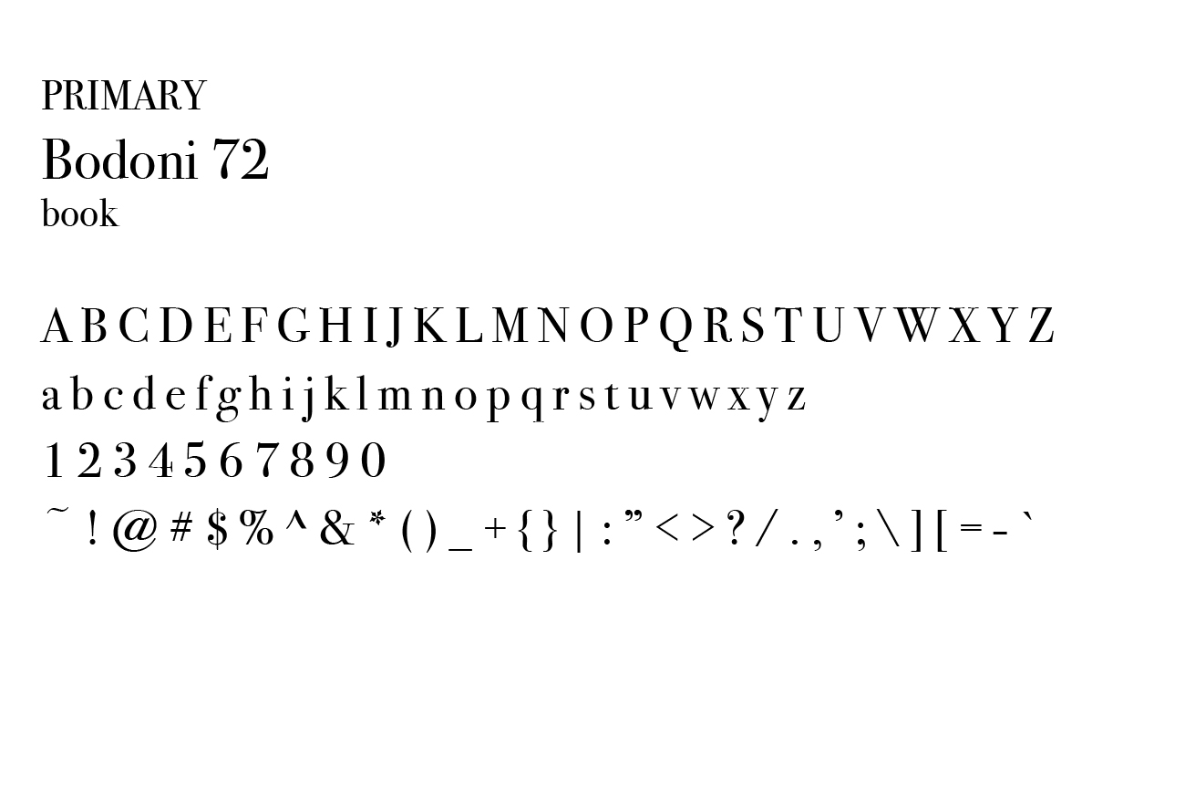
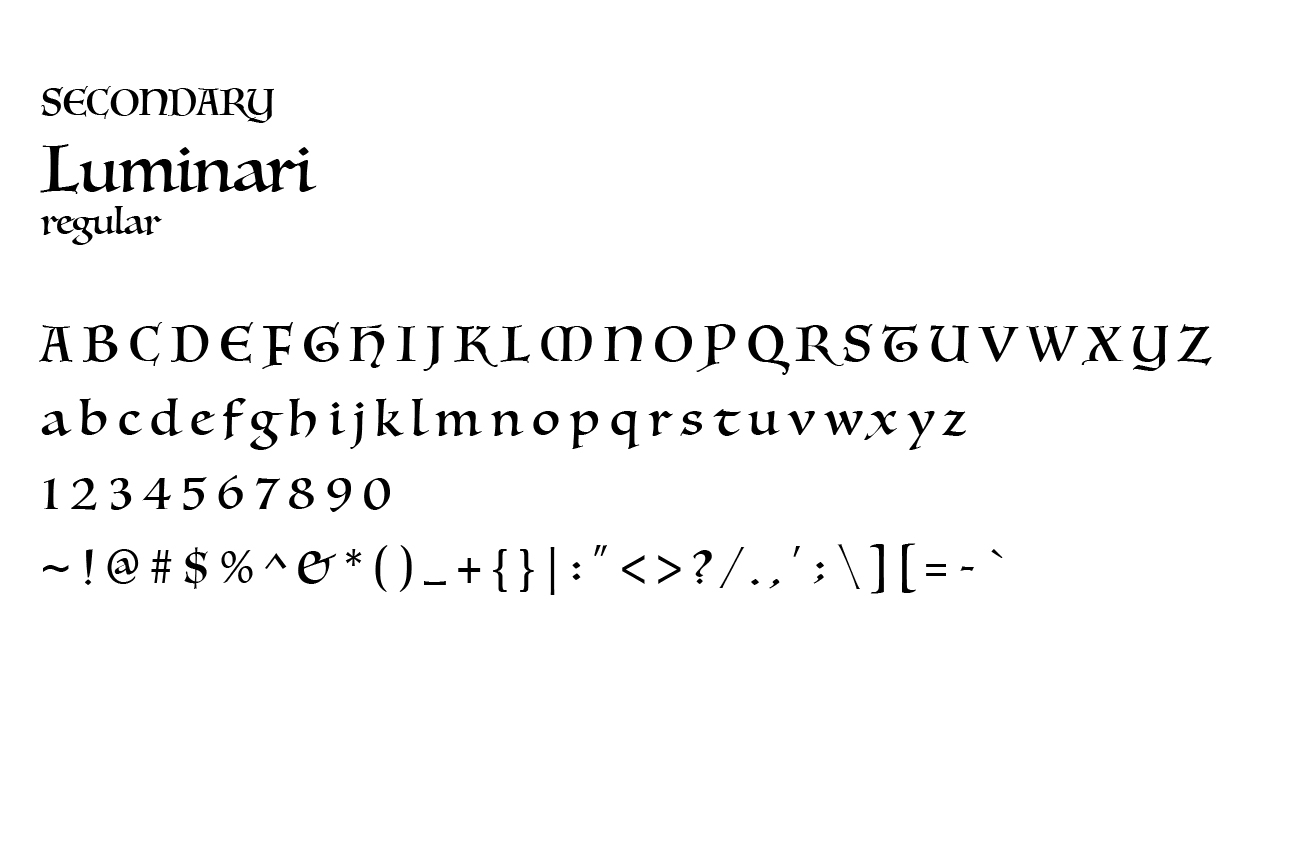
Since this is a jewelry brand, I chose Luminari—a calligraphy-style script font that beautifully reflects elegance and luxury. To complement it, Bodoni 72 was selected for its timeless sophistication, defined by its striking contrast and delicate hairlines, creating a refined and polished brand look.
Magazine
Design
An editorial magazine for a fictional jewelry brand that celebrates the traditions behind Indian bridal jewelry. I paired Devanagari-inspired display type with clean serif text and gave each section its own accent color. Full-bleed bridal photography and custom text-wrap layouts give it a rich, luxurious feel.